

.webp)
Most Power BI dashboards look impressive in demos. The ones that actually get used share one thing in common they show exactly the right metric to exactly the right person.Here are 10 examples that do that well. Whether you're in sales, finance, or operations, creating dashboards that track KPIs and provide actionable insights is essential for impactful reports. Organizations looking to hire Power BI developer, explore enterprise Power BI solutions, or invest in professional Power BI services are taking the next step toward scalable, insight-driven business intelligence.
This guide showcases 10 Power BI dashboard examples that will inspire your next report, highlighting key features and design elements that elevate your dashboards. From sales dashboards to financial performance tracking, discover how to customize Power BI for your unique business needs.
What’s inside? Keep reading for:
10 Power BI dashboard examples that get you motivated
Key features that enhance data visualization and real-time insights
Tips for customizing your Power BI report builder to optimize performance
Let’s explore how Power BI dashboards can transform your reports and decision-making!
Why Power BI Dashboards Matter in Modern Data Reporting
Data visualization plays a key role in strategic decision-making processes. Power BI dashboards dashboard development services provide a visual representation of your organization's data, helping business leaders quickly spot trends, track key performance indicators (KPIs), and make informed decisions. These dashboards, featuring tools like bar charts and other interactive dashboards, allow you to present essential metrics and actionable insights in a way that is both engaging and insightful. Whether it’s for a Financial Analytics Dashboard or a sales dashboard, Power BI ensures that the data presented is clear, concise, and aligned with business goals. This ultimately drives data-driven decisions across departments, enabling teams, such as Sales teams, to act on real-time insights and make effective dashboards for improved performance.
Key Features That Make a Power BI Dashboard Stand Out
The ability of Power BI dashboards to provide a thorough picture of your business indicators makes them unique. Whether it’s tracking sales performance, understanding marketing strategies, or analyzing financial performance, Power BI integrates seamlessly with data from multiple sources like Google Analytics, Excel, and Tableau dashboards. The interactive nature of Power BI dashboard examples allows users to dive deeper into the data with just a few clicks. Key features that set Power BI apart include:
- Interactive Charts and Graphs: Whether it's column charts, bar charts, pie charts, or gauge charts, Power BI supports a wide range of visual tools to represent data.
- Real-Time Data: Ensure your dashboard always reflects up-to-date information.
- Customizable Templates: Build custom dashboards suited to your organization's unique business performance needs.
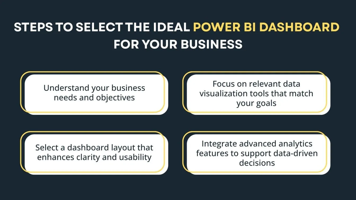
How to Choose the Right Power BI Dashboard for Your Business Needs
When selecting the right Power BI dashboard, it's essential to understand your business needs and objectives. Whether you're aiming to enhance KPI tracking or improve marketing efforts, you should focus on dashboards that offer deeper insights into your business performance. Business intelligence services can help tailor dashboards to meet these specific goals. The following advice will help you make an informed decision:
- Determine the key metrics most important to your team (e.g., sales performance, customer satisfaction ratings).
- Choose a dashboard design that presents these metrics clearly.
- Incorporate AI data visualization for advanced analytics.
You can also explore our ready-made BI templates covering finance, marketing, HR, and more — built for quick deployment.
How Leading Industries Benefit from Power BI Analytics
Power BI isn’t just for one type of business. Industries are changing as a result of its ability to make data-driven decisions more quickly and precisely. From sales dashboards in retail to healthcare operations dashboards for hospitals, industries across the globe are using Power BI to enhance operational efficiency.
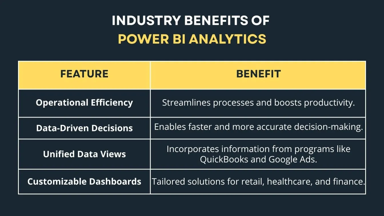
For instance, the financial performance dashboard helps organizations monitor revenue growth, while the marketing dashboards support campaign performance monitoring. Power BI’s ability to integrate with other data sources like Google Ads or QuickBooks Online gives companies a unified view of their business metrics.
10 Impressive Power BI Dashboard Examples to Inspire Your Next Report
Let’s dive into some Power BI dashboard examples to fuel your next data visualization project. These 10 dashboards showcase the best use cases of Power BI across various industries.
1. Executive Overview Dashboard
The Executive Overview Dashboard is your go-to tool for a high-level snapshot of business performance. It highlights critical metrics and key performance indicators (KPIs) that are vital for leadership. With interactive visualizations like doughnut charts, decision-makers can quickly assess overall performance and dive into detailed insights.
By analyzing audience behavior and tracking marketing campaigns, leaders are empowered to make strategic decisions based on relevant metrics. Whether evaluating delivery methods or shipping mode, this dashboard provides an efficient and comprehensive view of the factors impacting performance, ensuring data-driven decisions are made in real-time.
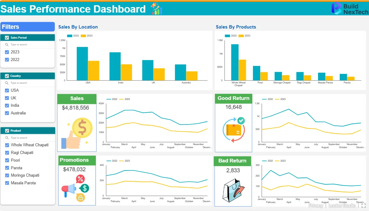
2. Sales Performance Dashboard
The Sales Performance Dashboard is a powerful tool for tracking sales data and aligning performance with targets. Here’s how it benefits your business:
- A clear, up-to-date picture of actual performance in comparison to sales goals is provided by visual representation.
- Key Metrics: Monitors conversion rates, revenue growth, and monthly trends, driving strategic planning.
- Marketing Insights: Helps social media managers assess the effectiveness of marketing channels and campaign performance.
- Wider Business Impact: Adaptable for tracking SEO dashboard insights, logistics dashboard data, and supplier performance.
- Customer Insights: Using donut charts, it provides a detailed view of Customer Segmentation Dashboard data, enabling a better understanding of customer behavior and improving business strategies.
Sales teams may use this dashboard to make well-informed decisions that will improve performance and optimize tactics.
3. Marketing Analytics Dashboard
The Marketing Analytics Dashboard is essential for measuring the success of your marketing efforts. Here’s how it helps:
- Track Performance: Monitors social media performance, email marketing, and campaign effectiveness.
- ROI Measurement: Measures the ROI of various marketing channels to optimize strategies.
- Cost Control: Keeps track of Actual Cost and cost per acquisition, ensuring efficient marketing spending.
- Revenue & User Insights: Provides insights into actual revenue, active users, and business users to inform decisions.
- Comprehensive View: This business intelligence tool gives a complete picture of key metrics, helping teams make data-driven choices for campaign optimization.
This dashboard empowers businesses to enhance marketing strategies for better results.
4. Financial Reporting Dashboard
The Financial Dashboard offers critical insights into your company’s financial health. Here’s how it adds value:
- Track Financial Performance: Monitors revenue growth, cost control, and other key financial metrics over time periods.
- Data-Driven Decisions: Enables CFOs and financial analysts to make informed decisions on budget allocation and expense management.
- Assess Financial Health: Analyzes Bounce Rate, accounts receivable, and average wait time to gauge financial stability.
- Monitor Quality Metrics: Tracks quality metrics and quality score to ensure financial process accuracy.
- Evaluate Delivery Standards: Supports the assessment of delivery standards to optimize financial performance and improve operational strategies.
This dashboard helps businesses manage their finances efficiently and make strategic decisions for growth.
See how we built a real-time financial data visualization dashboard for an enterprise client reducing reporting time by 50%.
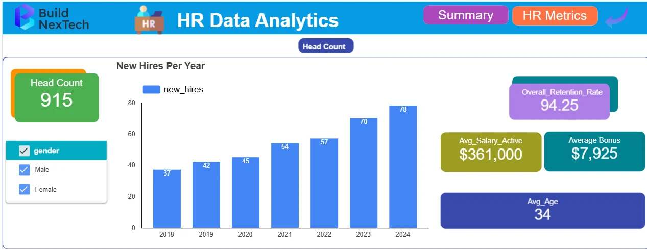
5. HR Analytics Dashboard
To improve HR initiatives, the HR Dashboard centralizes people analytics. Here's how it helps:
- Track Key Metrics: Monitors employee performance, recruitment progress, and turnover rates.
- Support Business Growth: Provides insights into metrics that drive business growth.
- Employee Engagement: Tracks awareness metrics related to employee engagement and company culture.
- Analyze HR Impact: Provides balance sheet measures to evaluate how HR choices affect the bottom line.
- Optimize HR Strategies: Helps HR teams retain top talent and improve overall business growth.
This dashboard guarantees that HR teams can support organizational performance by making well-informed decisions.
6. Customer Insights Dashboard
The customer insights dashboard aggregates data from different customer touchpoints, offering insights into customer satisfaction, behavior, and preferences. This is key for marketing teams and business intelligence analysts to create targeted campaigns that increase customer engagement. Teams often rely on a KPI tracking dashboard or use a KPI tracking template in Excel to streamline performance monitoring. Understanding what KPI tracking involves is crucial for effective analysis. Leveraging business intelligence analytics and working with a business intelligence consultant can further enhance decision-making. More precise and useful customer insights are guaranteed when business intelligence and analytics are combined with the best business intelligence technologies.
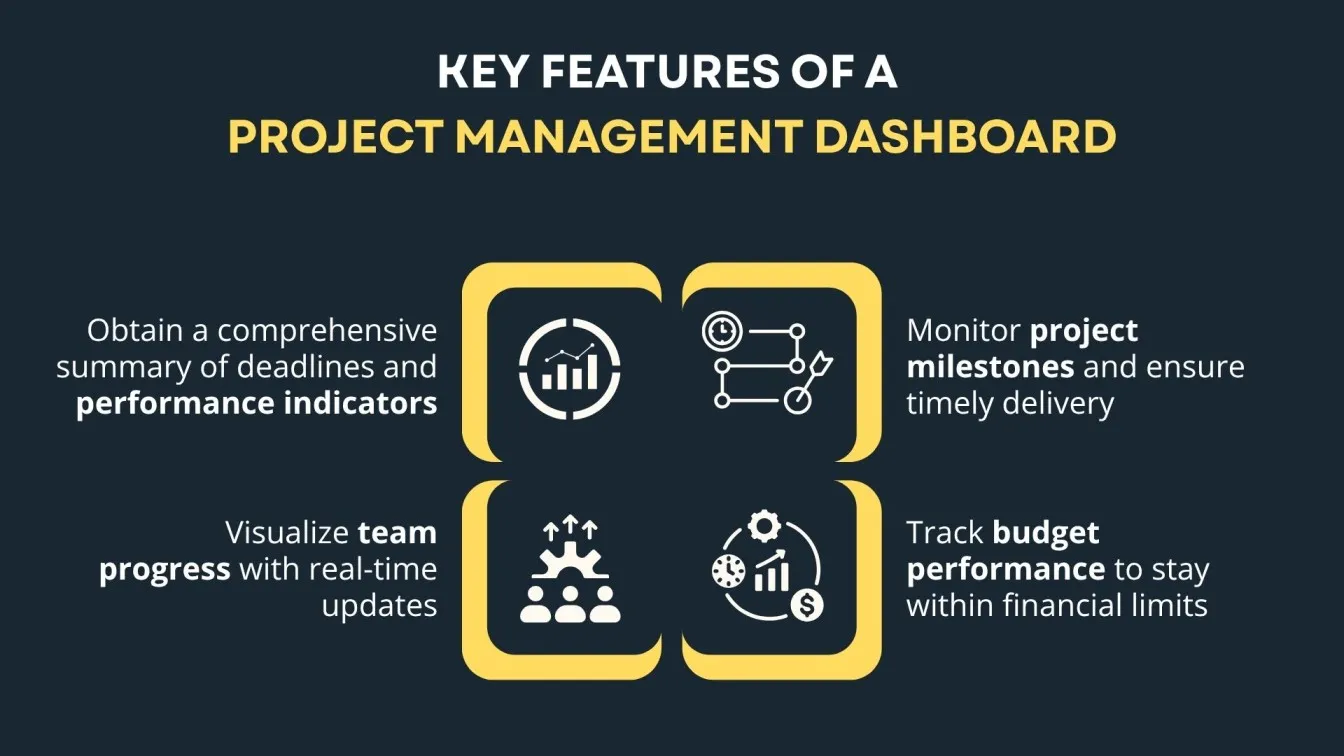
7. Project Management Dashboard
Track project milestones, budget performance, and team progress with this dashboard. It offers a quick overview of project timelines and performance metrics, ensuring that projects stay on track and within budget. With support from business intelligence consulting and the right business intelligence tools, teams can enhance visibility and decision-making. This kind of dashboard data visualization benefits greatly from the use of big data visualization tools and insights from a skilled data visualization specialist. By incorporating various types of data visualization into a unified data visualization dashboard, organizations can effectively interpret big data visualization for smarter project management.
8. Healthcare Operations Dashboard
For healthcare organizations, this dashboard helps monitor patient care metrics, staff performance, and hospital operational efficiency. It provides real-time insights into day-to-day operations, helping hospital managers make informed decisions that impact patient care. Healthcare teams often rely on PowerBI dashboards, Excel dashboards, and other data dashboards to centralize insights. Using KPI dashboards and analytics dashboards enables deeper performance tracking. Professionals skilled in data visualization jobs often use tools like Tableau data visualization and Power BI Pro to bring clarity to complex datasets. Understanding how to use Power BI effectively ensures these tools drive actionable decisions in fast-paced healthcare environments.
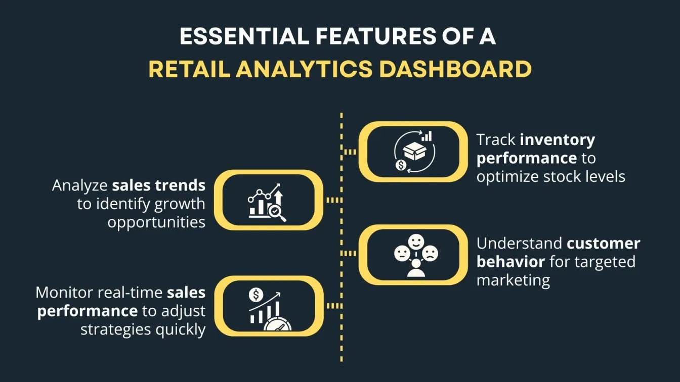
9. Retail Analytics Dashboard
For monitoring customer behavior, sales trends, and inventory performance, a retail analytics dashboard is essential. Retailers can monitor sales performance in real-time, providing them with insights on how to adjust marketing strategies for maximum impact.
10. Education Performance Dashboard
Education institutions use this dashboard to monitor student performance, attendance, and teacher effectiveness. It allows educators to track key metrics related to student success and identify areas for improvement. Many schools and universities utilize platforms like Power BI Service to deploy these dashboards efficiently. With growing demand for data-driven education, roles in Power BI jobs are expanding. Understanding the comparison between Tableau vs Power BI or Power BI vs Tableau helps institutions choose the right tool for their needs. Teachers and administrators can easily access the data with a Power BI login and work with it at any time.
Design Tips to Make Your Power BI Dashboards More Engaging
The design of your Power BI dashboard plays a crucial role in how effectively your data is communicated. The following design advice will guarantee that your dashboard provides insightful information:
- Focus on Key Insights: Highlight the most important KPI tracking metrics, such as sales performance and financial performance, while ensuring other data points are easily accessible.
- Use Interactive Visual Tools: Incorporate pie charts, funnel charts, and column charts to make your data more engaging and allow users to explore deeper insights.
- Consistency: Maintain a consistent layout and color scheme to ensure that the data is easily readable and aligned with your branding.
For teams ready to go beyond static dashboards, explore how AI-powered reporting can automate insights and detect anomalies in real time.
Conclusion
Power BI dashboards are essential for transforming data into actionable insights, enabling businesses to make data-driven decisions. Here's a quick recap:
- Business Intelligence: Power BI dashboards help track KPIs, monitor business performance, and drive strategic decisions. Whether it's a financial dashboard or a performance tracking board, Power BI ensures focus on critical metrics that matter.
- Core Features: Interactive charts, real-time data, and customizable templates make Power BI a top choice for data visualization and KPI tracking. As an analytical tool, it enhances data interpretation across departments.
- Industry Benefits: Sectors like retail, healthcare, and education leverage Power BI to improve operational efficiency and customer satisfaction by delivering a better user experience through data clarity.
- Customization: Tailoring your dashboard to highlight the most important metrics ensures it provides valuable insights for decision-makers.
Power BI empowers businesses to track performance, make smarter decisions, and foster growth.The right Power BI dashboard depends on what decision you're trying to make faster. Sales teams need pipeline visibility. Finance needs cash flow clarity. HR needs attrition signals. Start with the one closest to your biggest blind spot — and build from there.
If you need a dashboard built or customized for your business, BuildNexTech delivers Power BI solutions 80% faster than in-house builds. See our BI services →
People Also Ask

What data sources can be connected to Power BI dashboards?
Power BI can connect to a wide range of data sources, including Excel, SQL databases, Salesforce, Google Analytics, and APIs, enabling seamless integration for customer acquisition and customer experience insights.
Is Power BI suitable for small businesses or only large enterprises?
Power BI is suitable for both small businesses and large enterprises, offering scalable features for tracking customer acquisition and improving customer experience with cost-effective plans.
How secure is the data in Power BI dashboards?
Power BI ensures data security through encryption, role-based access control, and compliance with standards like GDPR, protecting customer acquisition and customer experience data.
Can Power BI dashboards be embedded in websites or apps?
Yes, Power BI dashboards can be embedded in websites or apps, allowing users to interact with analytics visualization in real-time and access customer experience insights.
What is the difference between Power BI dashboards and Power BI reports?
Power BI dashboards offer a quick, interactive overview of key metrics, while reports provide in-depth, detailed analysis of trends and data, helping businesses track customer acquisition and marketing strategies.


.webp)
.webp)
.webp)