


Poor Power BI dashboards waste millions of dollars annually across organizations worldwide. According to Gartner research cited by BI Brainz (2019), 85% of big data projects fail, resulting in $159B of wasted investment.. Most dashboard mistakes are completely preventable with proper planning and expert guidance.
This comprehensive guide reveals critical Power BI pitfalls that damage business intelligence initiatives. You'll learn expert solutions to transform your dashboard implementations. These proven strategies help organizations avoid costly redesigns and improve user adoption rates significantly.
Understanding the High Cost of Power BI Dashboard Implementation Mistakes
Bad Power BI dashboards hurt businesses in multiple ways beyond initial development costs. According to Gartner's research, 65% of organizations still use data selectively to justify decisions they've already made, rather than letting the data truly drive decision-making. This creates competitive disadvantages when stakeholders can't interpret business data quickly and effectively.
Many Power BI data analysts underestimate how design flaws impact user adoption rates. Research from UX studies shows that 88% of people are less inclined to return to a site after a bad UX, and this principle applies directly to dashboard experiences. This happens because developers focus on technical capabilities rather than user needs and business requirements.
Organizations typically spend significantly more on rework when they ignore design principles from the start. Understanding these mistakes helps prevent expensive redesigns later in project lifecycles. Organizations that follow structured development processes see significantly higher adoption rates and experience fewer post-deployment issues according to Microsoft's Power BI implementation guidance.
Design and Visual Mistakes That Kill User Engagement and Adoption
The way dashboards look and feel has a huge influence on user adoption. Even the most accurate data fails if visual design makes interpretation difficult.
Overcrowding Your Dashboard Pages with Too Many Complex Visuals
The "everything on one page" problem destroys dashboard effectiveness instantly for users. It overwhelms users with information they cannot process efficiently during busy work periods. Research from user experience studies shows that visual complexity significantly reduces comprehension rates.
Decision-makers need focused insights that guide specific actions rather than overwhelming displays. They don't want comprehensive data dumps requiring extensive interpretation time from their schedules. Good dashboard design follows established usability principles from cognitive psychology research.
Crowded layouts force people to hunt for relevant information during critical decision moments. This reduces engagement significantly and causes dashboard abandonment over time periods. Here's how to fix overcrowding problems effectively:
- Start with three primary visuals per page, addressing specific business questions
- Make each visual serve a distinct business purpose rather than technical showcasing
- Use drill-throughs and bookmarks for additional detail without cluttering main views
- Add sufficient white space between elements to improve visual clarity
Choosing the Wrong Chart Types for Your Specific Data Sets
Wrong chart choices ruin even accurate business data completely for stakeholders. Many Power BI developers use bar charts by default without considering alternatives. Academic research on data visualization shows that inappropriate visualization choices significantly reduce understanding among users.
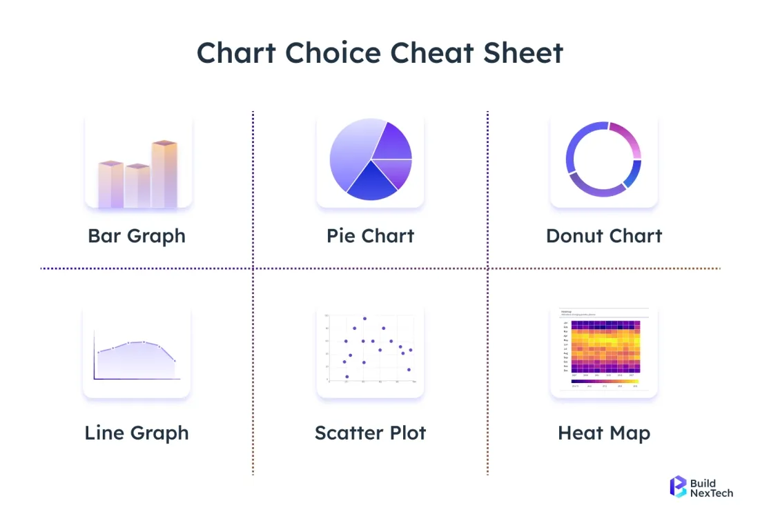
Different charts work optimally for different data types and business questions effectively. Waterfall charts show changes in KPIs over time perfectly for analysis. Use them for budget variances, revenue progression, and sequential analysis projects. Bubble charts display three-dimensional metric relationships effectively for portfolio analysis work.
Follow these chart selection rules to improve data comprehension for users:
- Avoid pie charts with more than five categories or precise comparisons
- Use line charts for time-series data and trend analysis specifically
- Choose bar charts for categorical comparisons and rankings clearly
- Consider your audience preferences - executives prefer simple charts over complex ones
Poor Color Choices and Inconsistent Branding Throughout Reports
Color mistakes create serious accessibility problems for many dashboard users worldwide. Approximately 8% of men and 0.5% of women worldwide have some form of color blindness, which can create substantial barriers to interpreting data visualizations. Yet many Power BI dashboards rely heavily on color differences exclusively.
Consistent branding builds trust in Power BI reports across organizational departments. Organizations with standard color schemes experience higher adoption rates compared to inconsistent designs. They create company-wide color guidelines that match corporate branding standards and policies.
Smart color usage tips for better accessibility and user engagement:
- Use bright colors only for critical alerts and exceptional situations
- Implement sufficient contrast ratios meeting WCAG accessibility standards for compliance
- Reserve color highlighting for important variances and trending patterns
- Test accessibility with color contrast tools before deployment to users
Ignoring Mobile Responsiveness in Dashboard Design and Development
Mobile business intelligence usage grows rapidly across all industries and organizations. Power BI has grown from 500,000 early adopters to over 375,000 organizations today—including 95% of the Fortune 500, with increasing mobile usage. Yet many dashboards fail completely on small screens and mobile devices.
Power BI mobile layouts need separate design consideration from desktop versions entirely. Desktop visuals often become unreadable on phones and tablets completely. Text becomes too small and navigation breaks down entirely for users.
Mobile design best practices for better user experience across devices:
- Design mobile-first before expanding to desktop views for consistency
- Ensure touch support for all interactive elements and filtering options
- Limit visuals per mobile page to maintain usability standards
- Test across different devices and screen sizes before deployment
Data Modeling Errors That Compromise Performance and Accuracy
Behind every great dashboard lies a solid data model. Mistakes here not only slow performance but also distort insights, leading to poor decision-making.
Inadequate Data Source Planning and Integration Strategy Development
Poor data source strategy creates performance problems and system crashes regularly. Many organizations connect Power BI directly to operational databases without consideration. This approach often crashes production systems during peak usage periods unnecessarily.
Effective Power BI data sources need careful architectural planning upfront from teams. Extract data into dedicated analytical databases when possible for performance. This approach protects operational systems while improving query performance for users.
Data source planning essentials for successful implementations across organizations:
- Document all data sources clearly with ownership information and contacts
- Create refresh schedules that avoid peak operational times systematically
- Build a comprehensive data dictionary explaining metrics and calculation methods
- Plan for system protection and performance optimization from the start
Poor Relationship Management Between Tables and Data Models
Relationship mistakes destroy data accuracy completely in Power BI reports and dashboards. Many developers create relationships without understanding the underlying business logic properly. These errors multiply through calculations and produce incorrect KPIs for stakeholders.
Star schema design provides the foundation for effective Power BI data models. Place fact tables at the center with dimension tables connected clearly. Avoid many-to-many relationships when possible because they complicate calculations significantly.
Relationship management tips for accurate data modeling in Power BI:
- Use Power BI Desktop's relationship view for visualization and validation
- Ensure filter context flows correctly through your model structure
- Test calculations thoroughly with known datasets for validation purposes
- Document all business logic clearly for future maintenance and updates
Inefficient DAX Formulas and Calculated Columns Implementation
DAX mistakes create performance problems and incorrect calculations simultaneously for users. Many developers write complex formulas without understanding the evaluation context properly. These inefficient expressions slow dashboard loading times significantly for stakeholders.
Calculated columns waste memory and increase file size unnecessarily for models. Use measures instead whenever possible for better performance characteristics. They calculate dynamically during query execution rather than storage requirements.
DAX optimization strategies for better performance and accuracy in calculations:
- Use DAX Studio to identify performance bottlenecks systematically in models
- Write clear, readable expressions with proper formatting and detailed comments
- Prefer measures over calculated columns for calculations whenever possible
- Test complex calculations thoroughly before deployment to production environments
Ignoring Data Refresh and Gateway Configuration Requirements
Data refresh failures frustrate users and destroy dashboard credibility completely. Many organizations deploy Power BI without proper gateway setup or configuration. This leads to stale data and broken user experiences regularly.
The Power BI service needs reliable gateway connections for on-premises data sources. Configure backup gateways for critical business applications and systems. Monitor gateway performance regularly and fix connectivity issues quickly when they occur.
Gateway management essentials for reliable data updates and system performance:
- Schedule refreshes during low-usage periods to minimize impact on systems
- Consider incremental loading for large datasets requiring frequent updates
- Document refresh schedules clearly for stakeholder communication and planning
- Communicate maintenance windows to users well in advance of changes
User Experience Mistakes That Reduce Dashboard Adoption Rates
Dashboards succeed only when they align with user needs. Ignoring usability principles results in underutilized reports and wasted development efforts.
Creating Dashboards Without Understanding User Needs and Requirements
User-centered design drives successful Power BI adoption throughout organizations and departments. Yet many developers create dashboards based on available data only. This approach usually results in technically impressive but unused tools. It wastes development resources and frustrates stakeholders expecting valuable insights.
Conduct stakeholder interviews before starting any development work on projects. Understand how different roles use business intelligence information daily. Executives need high-level KPIs for strategic decisions while managers need detailed information.
User research best practices for successful dashboard development projects:
- Create detailed personas that guide design decisions throughout development cycles
- Document specific questions dashboards should answer for each user role
- Interview different user types separately to understand unique needs
- Focus on delivering business value over creating impressive technical visuals
Lack of Proper Navigation and Filtering Options Throughout Reports
Poor navigation destroys user experience in complex Power BI reports completely. When users can't find information quickly, they abandon dashboards permanently. Research shows that mobile users are 5 times more likely to abandon a task if a site isn't mobile-optimized, and similar principles apply to dashboard navigation.
Implement consistent navigation patterns across all Power BI reports in organizations. Use bookmarks to create guided analytical journeys for users. Provide clear breadcrumbs showing current location within complex structures and hierarchies.
Navigation improvement tips for better user experience across all reports:
- Use consistent filter placement across all related reports and dashboards
- Place important filters prominently at the top of pages
- Follow logical hierarchies that match business thinking patterns and workflows
- Provide clear visual indicators for current location and available options
Missing Context and Explanatory Elements for Complex Metrics
Context-free dashboards confuse users and reduce trust in data quality. Many Power BI reports show metrics without explaining calculation methods clearly. This lack of transparency hurts credibility and adoption rates significantly.
Add tooltips that explain complex metrics clearly in business terms. Include data source information and refresh timestamps prominently on dashboards. This transparency builds confidence and helps users understand limitations and delays.
Context enhancement strategies for better user understanding of data:
- Create self-explanatory visualizations that tell clear stories about performance
- Use descriptive titles and labels that eliminate ambiguity completely
- Add brief explanatory text for complex analytical concepts and calculations
- Show data freshness and source information prominently on every page
Overwhelming Users with Technical Jargon and Database Terminology
Technical language drives away business users from Power BI dashboards permanently. Data analysts often use database terms that mean nothing to managers. This communication gap prevents effective business intelligence use across organizations.
Translate technical metrics into familiar business language consistently throughout reports. Replace database field names with clear, descriptive labels. Explain complex calculations in simple terms that everyone understands easily.
Language simplification tips for broader user adoption across organizations:
- Use familiar business terminology instead of technical database names
- Create glossaries for unavoidable technical terms and concepts
- Focus on business outcomes rather than technical implementation details
- Test language clarity with actual users before deployment to production
Performance and Technical Mistakes That Impact System Reliability
Technical gaps, from licensing to testing, can significantly weaken system reliability and undermine trust in dashboards. Addressing these early prevents costly setbacks.
Ignoring Power BI Licensing and Capacity Limitations During Planning
Licensing mistakes create unexpected costs and performance problems later in projects. Many organizations deploy Power BI without understanding capacity limitations properly. Three licenses—Power BI Premium P, Power BI Premium EM, and Azure Power BI Embedded— will drop off Microsoft price lists Jan. 1, 2025, which will force customers to eventually replace them with Fabric licenses.
Power BI Pro licenses limit sharing capabilities and dataset sizes significantly. Premium capacity provides better performance for large-scale implementations across organizations. Evaluate organizational needs carefully before choosing specific licensing models for projects.
Licensing planning considerations for cost-effective implementations across organizations:
- Monitor performance metrics regularly to identify capacity constraints early
- Plan for growth in both user adoption and data volumes
- Consider Microsoft Fabric for very large datasets exceeding current limits
- Evaluate cost-benefit analysis of different license types carefully before committing
Poor Security and Access Control Implementation Across Organizations
Security oversights expose sensitive business data and violate compliance requirements. Many Power BI implementations lack proper permissions management systems initially. These gaps create legal risks and hurt stakeholder trust significantly.
Row-Level Security ensures users see only appropriate data for their roles. Implement this feature carefully to prevent data leakage problems. Test security controls thoroughly with different user accounts before production deployment.
Security implementation essentials for protecting sensitive data across systems:
- Document all permissions and access controls clearly for audit purposes
- Conduct regular security audits to identify vulnerabilities and gaps
- Work closely with IT departments on organizational alignment and policies
- Test access controls thoroughly before production deployment to users
Inadequate Testing and Quality Assurance Processes Before Deployment
Quality problems destroy dashboard credibility and user confidence completely. Many organizations deploy Power BI without thorough testing processes or procedures. These shortcuts result in incorrect calculations and poor performance for users.
Create comprehensive testing checklists covering calculations, performance, and security aspects. Test dashboards with realistic data volumes and user loads. Validate all calculations against known results before sharing with stakeholders.
Testing process improvements for better quality assurance across projects:
- Establish version control systems for development projects and changes
- Document changes and test results systematically for tracking purposes
- Test user experience across different devices and browsers thoroughly
- Plan rollback procedures for when problems occur post-deployment
Comparison Insights: Power BI vs Tableau Common Implementation Mistakes
Organizations often migrate between tools. Comparing Power BI with Tableau highlights common pitfalls that teams face during transitions.
Migration Mistakes When Switching from Tableau to Power BI Platforms
Organizations switching platforms often repeat familiar patterns without proper adaptation. Tableau excels at exploratory data analysis and advanced visualizations capabilities. Microsoft has been positioned as a Leader in the 2025 Gartner Magic Quadrant for Analytics and Business Intelligence Platforms, showing Power BI's competitive position.
Data modeling approaches differ significantly between the two platforms completely. Tableau's live connections work well for smaller datasets and exploratory analysis. Power BI's imported data models provide better performance for complex analysis projects.
Migration planning considerations for successful platform transitions across organizations:
- Budget sufficient time for redesigning complex dashboards completely from scratch
- Plan data architecture changes carefully with technical teams and stakeholders
- Understand visual capability differences between platforms thoroughly before starting
- Train development teams on platform-specific best practices and methodologies
Avoiding Cross-Platform Compatibility Issues in Multi-Tool Environments
Multi-platform environments create integration challenges that many organizations underestimate significantly. Sharing dashboards between different business intelligence tools requires careful planning. Compatibility issues often force expensive architectural changes later in projects.
Standardize data models and metrics across all visualization tools used. This consistency enables easier migration and comparison between platforms. Document business rules clearly to ensure consistent calculations across systems.
Compatibility planning tips for seamless multi-platform operations across tools:
- Consider export and integration requirements early in platform selection decisions
- Evaluate long-term technology strategy before making platform commitments
- Plan for standardized data sources across all tools and systems
- Document integration requirements clearly for technical teams and stakeholders
Industry-Specific Dashboard Mistakes and Solutions for Different Sectors
Different industries have unique BI needs. From healthcare compliance to retail scalability, mistakes here can severely impact operations and outcomes.
Financial Services Dashboard Pitfalls and Regulatory Compliance Issues
Financial organizations face unique regulatory and performance requirements daily. Compliance mandates require specific data retention and audit trails. Many Power BI implementations overlook these requirements initially during development.
Real-time data needs often conflict with standard refresh schedules and capabilities. Trading operations and risk management need second-by-second updates for decisions. Plan for these requirements during initial system design and architecture.
Financial industry considerations for compliant implementations across organizations:
- Implement robust data governance processes for audit requirements and regulations
- Track all changes and calculations for regulatory reporting and compliance
- Consider specialized tools for compliance-critical reporting needs and requirements
- Plan for real-time data integration requirements carefully from the start
Healthcare Analytics Common Errors and Privacy Regulation Compliance
Healthcare data visualization must comply with HIPAA and privacy regulations strictly. Many Power BI implementations lack proper security controls initially during deployment. This creates significant legal risks for patient information and organizational liability.
Patient data requires careful anonymization and aggregation techniques consistently. Avoid displaying individual patient information in shared dashboards or reports. Implement strong row-level security based on healthcare worker roles and responsibilities.
Healthcare-specific requirements for safe and effective analytics across organizations:
- Test all analytics implementations with clinical stakeholders thoroughly before deployment
- Document assumptions and limitations clearly for medical users and stakeholders
- Focus on aggregated data rather than individual patient information
- Ensure strict compliance with medical privacy laws and regulations
Retail and E-commerce Dashboard Mistakes and Operational Challenges
Retail analytics often focus too heavily on historical performance data only. Many Power BI dashboards show what happened without guiding future decisions. This limits business value significantly and frustrates operational managers expecting actionable insights.
Customer journey visualization requires privacy consideration and integration planning carefully. E-commerce platforms generate massive datasets that overwhelm standard capacity limits. Plan for scalable data architecture that grows with business needs.
Retail analytics improvements for better operational decision-making across organizations:
- Focus on actionable metrics that drive operational decisions and improvements
- Balance detailed product information with high-level trend analysis effectively
- Plan for massive dataset management and performance optimization strategies
- Integrate inventory management with demand forecasting capabilities for efficiency
Advanced Solutions and Best Practices for Power BI Excellence
To move beyond common errors, organizations must adopt advanced practices—automation, templates, and AI integration—to achieve long-term BI success.
Implementing Automated Power BI Reports and Intelligent Alert Systems
Automation helps cut down on manual tasks and makes sure that important information reaches the people who need it on time. By 2027, 50% of business decisions will be augmented or automated by AI agents for decision intelligence according to Gartner predictions. This forces analysts to spend time on repetitive tasks unnecessarily.
Configure intelligent alerts for significant business changes and exceptions automatically. Set appropriate thresholds that avoid false alarm fatigue for users. Test alert sensitivity carefully to ensure reliability and relevance.
Automation implementation tips for improved efficiency and reliability across systems:
- Use paginated reports for formal compliance and regulatory reporting needs
- Automate report generation and distribution to reduce manual overhead significantly
- Reduce manual processes with smart scheduling and trigger configurations
- Test automation reliability thoroughly before production deployment to users
Creating Scalable Dashboard Templates and Standardized Design Patterns
Standardized templates accelerate development and ensure consistent user experiences. Many organizations recreate similar dashboards repeatedly across different departments. This wastes development resources and creates maintenance nightmares for teams.
Develop reusable Power BI templates for common analytical patterns and use cases. Include standard colors, fonts, and layouts matching corporate branding guidelines. This consistency improves user adoption and reduces training requirements significantly.
Template development strategies for organizational efficiency and consistency across projects:
- Document template usage guidelines clearly for development teams and stakeholders
- Provide comprehensive training for template customization and adaptation processes
- Maintain strict version control for consistency across implementations and departments
- Capture common analytical patterns effectively for reuse across projects
Integrating Advanced Analytics and AI Features for Enhanced Insights
Copilot in Power BI enables users to ask questions, generate DAX calculations, summarize reports, and create visuals simply by describing what they need. Many organizations implement these features without clear business objectives or strategies.
Machine learning integration should address specific business challenges directly and effectively. Identify clear use cases where predictive analytics improve decisions significantly. Validate model accuracy regularly and communicate limitations clearly to stakeholders.
AI integration best practices for meaningful business value across organizations:
- Test natural language query features with actual users thoroughly before deployment
- Communicate model limitations and accuracy clearly to stakeholders and users
- Focus on solving business problems rather than technical showcasing or demonstrations
- Plan for ongoing model maintenance and validation requirements systematically
Measuring Success and Continuous Improvement for Long-Term Value
Dashboards are never “done.” Measuring success and iterating ensures your BI investments remain relevant and impactful.
Key Metrics for Dashboard Performance Evaluation and Business Impact
Success measurement requires clear metrics aligned with business objectives and outcomes. Many organizations track usage statistics without understanding actual value delivered. This misses critical improvement opportunities and wastes resources on ineffective solutions.
User engagement analytics show how stakeholders interact with dashboards over time. Monitor which visuals receive attention and which filters users apply. This information guides optimization efforts and identifies improvement opportunities for teams.
Key points for measuring performance to help improve and evaluate organizations effectively:
- Define clear goals for how fast a website or app should load to keep users satisfied
- Use Power BI Performance Analyzer to find and fix issues that slow things down and make improvements.
- Track user satisfaction alongside technical usage statistics and metrics
- Monitor business outcome improvements directly attributable to dashboard implementations
Gathering User Feedback and Iterating Based on Real Usage
Continuous improvement requires systematic feedback collection and response processes. Many successful Power BI implementations establish regular feedback loops according to Microsoft guidance. This captures user experiences and translates them into specific enhancements.
Create multiple feedback channels for different communication preferences and organizational styles. Some users prefer formal surveys while others provide better insights through conversations. Capture feedback consistently to identify patterns and improvement priorities.
Feedback collection strategies for continuous improvement and user satisfaction:
- Test alternative dashboard designs with different user groups systematically
- Document results clearly and apply successful approaches broadly across projects
- Establish both formal survey and informal conversation feedback channels
- Respond to user feedback with visible improvements and clear communication
Staying Updated with Power BI Feature Releases and Industry Developments
Microsoft regularly updates Power BI with new capabilities and features, including recent AI enhancements and mobile improvements. Many organizations miss improvement opportunities because they don't track developments systematically.
Follow Microsoft's official roadmap through official channels and community resources. Evaluate new features against organizational needs and priorities carefully. Plan feature adoption systematically to avoid workflow disruption for users.
Platform development tracking for competitive advantage and continuous improvement:
- Participate actively in user groups and online community forums
- Share lessons learned with the broader business intelligence community
- Plan feature adoption systematically with technical and business teams
- Evaluate new capabilities against specific business priorities and objectives
Conclusion: Building Error-Free Power BI Dashboards for Long-Term Success
Successfully avoiding dashboard mistakes requires systematic attention to design principles, particularly when developing business intelligence services and comprehensive business intelligence dashboard solutions. BuildNexTech's structured processes help organizations achieve higher adoption rates and fewer post-deployment issues.
Pre-deployment audits must cover data accuracy and performance, especially for Shopify analytics dashboard and analytics for Shopify implementations. Create standardized checklists ensuring consistent quality across projects while maintaining accurate revenue tracking and reliable marketing metrics.
Continuous improvement ensures your sales analysis dashboard evolves with business needs. BuildNexTech recommends regular review cycles that evaluate marketing performance metrics and gather user feedback for data-driven enhancements.
Advanced training helps teams stay current with business intelligence dashboard capabilities. At BuildNexTech, we build internal expertise that creates organizational capabilities supporting long-term analytics success and sustainable growth.
People Also Ask

Can Power BI dashboards work offline?
Yes, Power BI Desktop allows offline report creation, but online features like dashboard sharing require internet access.
Does Power BI support integration with SQL Server, Azure, and Excel?
Yes, Power BI natively integrates with SQL Server, Azure services, and Excel files for seamless data import and analysis.
Can I embed Power BI dashboards in my company website?
Yes, dashboards can be embedded using Power BI Embedded or publish-to-web options, depending on access needs.
Can I set up automatic data masking in Power BI dashboards?
Yes, you can apply data masking using Power Query transformations or row-level security combined with DAX logic.
Can I use Power BI dashboards with Google Analytics 4?
Yes, Power BI can connect to GA4 using the Google Analytics connector or through API-based custom connectors.


.webp)
.webp)
.webp)