
.png)
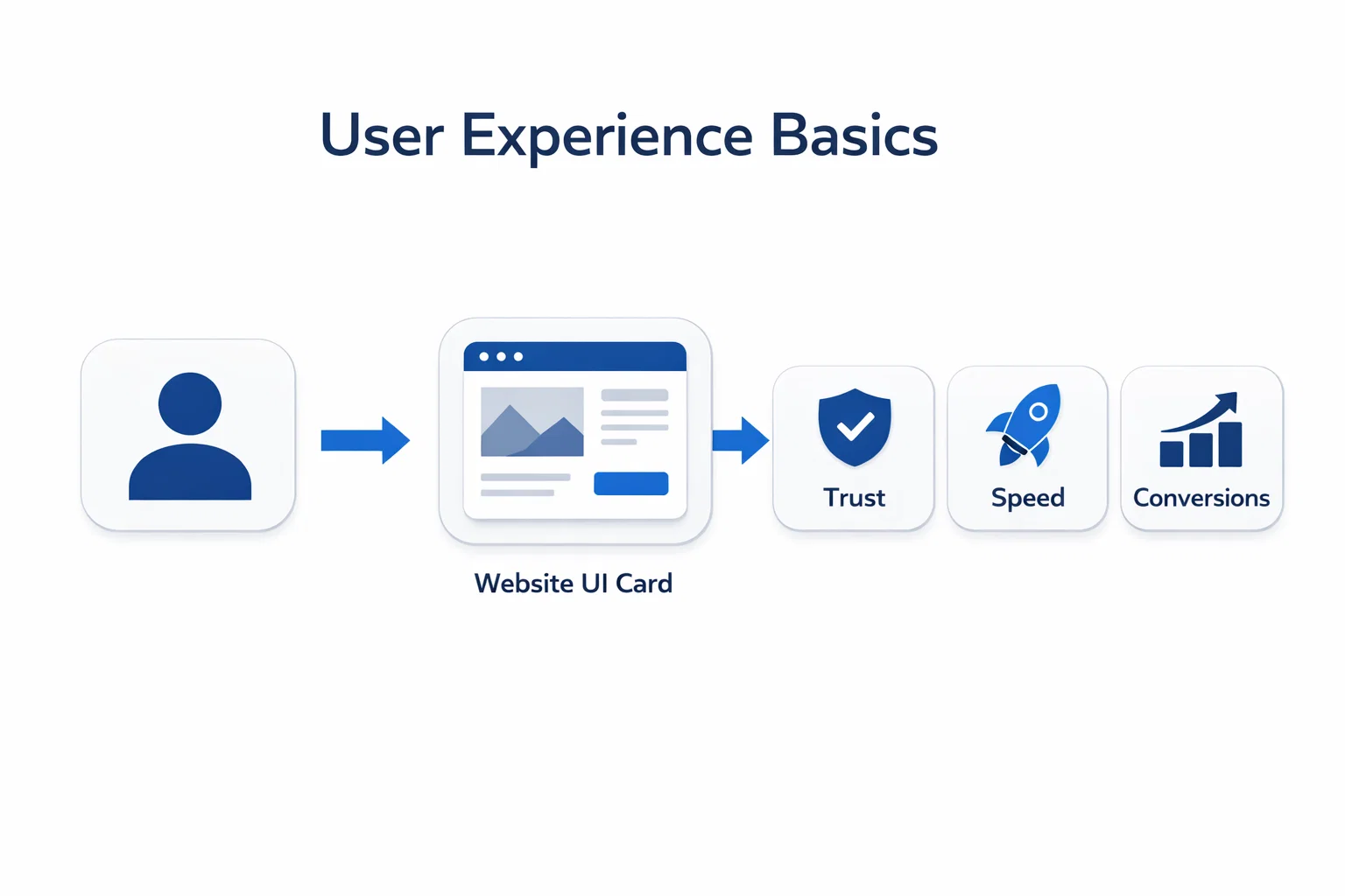
User Experience Basics isn’t just about making a website look good but it’s about making it easy, fast, and enjoyable for real people to complete real tasks. When UX is done right, visitors stay longer, trust your brand more, and convert faster. For CEOs and CTOs, this isn’t a “design topic”; it’s business leverage. For coders and researchers, UX is the bridge between human intent and system behavior.
Here’s what you can learn in this guide on User Experience Basics: the UX basics that matter most for modern websites' layout, usability, accessibility, navigation, and testing. You’ll also see how UX impacts SEO and why Google evaluates user experience signals like Core Web Vitals when it comes to Search performance.
At BuildNexTech, we work with SaaS teams, product companies, and enterprise decision-makers to design and validate AI-ready digital experiences. Based in US, we help brands turn complex ideas into usable interfaces through UX research, performance engineering, rapid prototyping, and testing workflows that support fast product-led growth.
What User Experience Means (And Why It Matters Today)
Before improving UX, you need to define it correctly. That is the starting point of User Experience Basics.
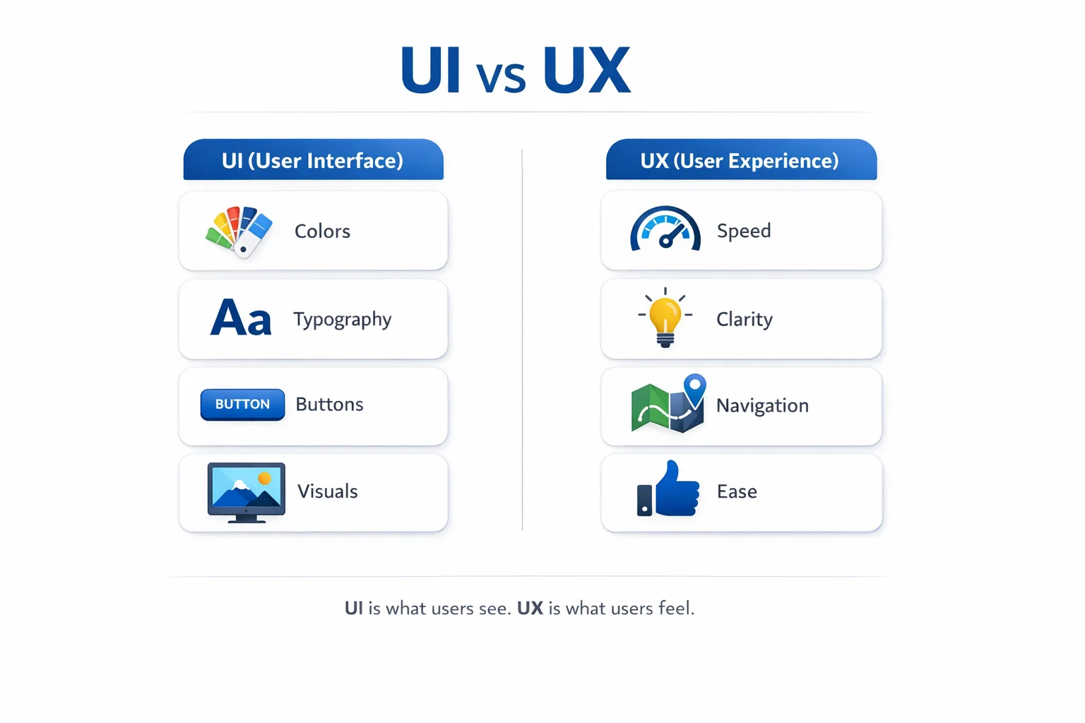
UX is not UI why? Here’s the difference
People often confuse user interface (UI) with user experience (UX design). User Experience Basics starts by understanding this difference. UI is what you see: colors, buttons, layout, typography, and visuals. UX is what you feel: whether the website is intuitive, responsive, and frustration-free.
A simple example: two websites can have the same UI (same mockups and branding), but different UX. One loads instantly and guides your user journey cleanly. The other delays, shifts content, and makes navigation unpredictable. The UI is identical, but the experience is not.
- UI = the interface (layout, colors, buttons, visuals)
- UX = the outcome (ease, clarity, speed, confidence)
- Great UX happens when the whole system supports humans, not just aesthetics
In short, UI is the presentation layer. UX is the total interaction design across the journey.
UX directly affects trust, leads, and sales
UX affects what leadership teams care about: revenue, lead quality, activation, and retention. When a website reduces friction, users explore more content, submit more forms, trust CTAs more, and abandon less often.
This is why UX has shifted from “design taste” to business-critical engineering. In fact, Forrester’s research is widely cited for showing that superior UX can improve conversion rates dramatically, even up to 400% in some contexts.
- Less confusion → higher conversions
- Better flows → better user control
- Fewer errors → better trust
- Cleaner confirmation states → lower anxiety
A frictionless user experience is one of the fastest paths to increasing conversions without increasing ad spend.This is exactly why User Experience Basics matters for growth.
UX is now connected to SEO and rankings
Modern SEO is no longer only about keywords and backlinks. UX now directly influences how search engines evaluate your website.
Google’s Web Vitals initiative defines user-centered signals that reflect “quality of experience,” and Core Web Vitals are designed to measure real-world UX such as load speed, interactivity, and visual stability.
- Better UX reduces pogo-sticking and bounce behavior
- Faster pages improve user engagement
- Stable layouts prevent rage clicks and abandonment
- UX-driven content hierarchy improves scanning and comprehension
In competitive industries (SaaS, fintech, healthtech), UX + SEO is now one combined game.
Learn the 7 UX Basics Every Website Must Get Right
If you want users to love your website, the fundamentals must be consistent. These User Experience Basics decide whether users stay, trust, and convert.
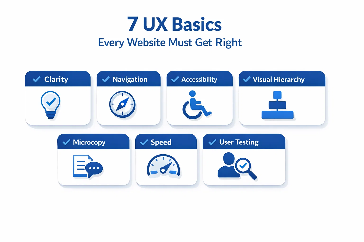
Clarity: users should never feel lost
A website should answer 3 questions within seconds: Where am I? What can I do here? What should I do next? If this isn’t clear, even the best visuals fail.
Clarity is especially important for coders and researchers: they don’t want “marketing fluff.” They want clean interfaces, meaningful content, and direct paths.
- Use a simple page structure
- Make the purpose obvious above the fold
- Avoid too many choices at once
Quick clarity improvements:
- One primary call-to-action per screen (not five)
- Reduce decision fatigue with fewer options
- Use headings to guide scanning and hierarchy
- Show “next step” buttons clearly
Clarity is the first UX rule because users don’t read, they scan.In User Experience Basics, clarity is always the first win because it reduces confusion instantly.
Navigation: make movement effortless
Navigation is not just menus. It’s the set of pathways that help users reach the exact website functionalities they came for.
Whether it’s a CTO browsing services or a CEO evaluating credibility, your navigation paths must feel predictable and stable across the system.
Best practices that work:
- Predictable top menu categories
- Breadcrumbs for deep pages
- Consistent placement for key buttons
- Search function for content-heavy websites
Navigation is where websites often fail silently. Users don’t complain, they just leave.
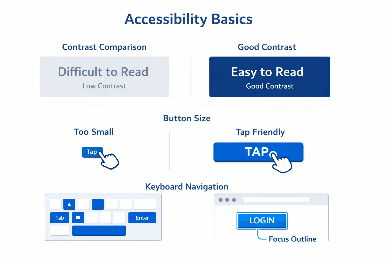
Accessibility: design for all users (not “some”)
Accessibility is foundational UX, not an afterthought. A readable interface helps everyone: older users, mobile UX users, low-vision users, and even people using your site in sunlight.
Many regions now have accessibility regulations or compliance expectations, so accessibility is also a risk-reduction investment.
Basics you can implement quickly:
- Strong contrast between text and background
- Font size that stays readable on mobile
- Keyboard navigation support
- Buttons that are large enough to tap reliably
- Avoid tooltips-only information
When accessibility improves, usability improves. It’s one of the highest ROI upgrades you can make.
UX Design Process (Beginner-Friendly Step-by-Step)
Great UX does not happen randomly. It comes from a clear process that reduces assumptions and improves decision-making.
Step 1: Understand user needs and intent
Great UX begins before design. It begins with research.
If you don’t know user needs, you’ll guess. And guessing creates interfaces that satisfy internal opinions not real users.
You can start with simple user research:
- Define your target audience
- Map what users want to accomplish
- Document the user journey from landing to conversion
Beginner-friendly tools:
- Google Forms (surveys)
- 1:1 interviews
- basic customer feedback collection
A strong UX design process always starts with understanding intent, not aesthetics.
Step 2: Wireframes and prototypes before visuals
Don’t jump into visuals first. Start with wireframing and a wireframe prototype to validate the structure before branding.
Tools like Figma and Adobe XD help teams collaborate quickly using interactive prototypes, especially across design + engineering teams.
Benefits of prototypes:
- Faster iterations
- Fewer dev rework cycles
- Cleaner design alignment between UI/UX tools and developers
You can also use low-code tools for quick interactive demos. For CTOs, this reduces time waste. For coders, this improves implementation accuracy.
Step 3: Validate with user testing
The most undervalued UX lever is user testing.
You don’t need 500 users. Testing with 5–10 real users can reveal the majority of high-impact usability issues (confusing navigation, unclear buttons, broken confirmation flows, etc.).
A practical workflow:
- Ask users to complete tasks
- Observe friction
- Fix error states and confusing modals
- Retest before launch
Modern trend: teams now blend user testing with heatmaps, session replays, and analytics so decisions are evidence-based, not emotional.
Visual Design Rules That Make UX Feel Premium
Once your foundation is strong, visual design makes the experience feel premium. This is where hierarchy, microcopy, and consistency create confidence.
Visual hierarchy: guide eyes naturally
Visual hierarchy helps your content communicate without forcing effort. It’s how your interface tells users what matters.
Hierarchy relies on:
- Typography sizing
- Layout rhythm
- Spacing consistency
- Color contrast and emphasis
When hierarchy is strong:
- Users scan faster
- Content becomes clearer
- Decision-making becomes easier
This is a major issue on “pretty websites”: everything is bold, everything is bright, everything is shouting. Premium UX feels calm, structured, and intentional.
Microcopy and UX writing: small words, big impact
Microcopy is tiny content that guides people through interactions: button labels, error states, confirmation text, and field hints.
This is one of the highest leverage improvements for conversions.
Fix microcopy like this:
- Replace “Submit” with action labels (e.g., “Get a Demo”, “Download Report”)
- Use human confirmation messages (“Saved successfully”)
- Explain errors clearly (“Password must be at least 8 characters”)
Microcopy makes your human-system interaction smoother and reduces friction in moments where users feel uncertain.
UI consistency and branding without confusion
Branding should strengthen UX, not reduce clarity.
Consistency in user interface elements improves usability and reduces cognitive load:
- consistent components
- consistent button style
- consistent form patterns
- consistent colors across systems
The goal is to build trust through predictable interaction design. When brand consistency is strong, users feel “this company is reliable” without consciously thinking it.
Website UX Meets Performance (Core Web Vitals + Speed)
User Experience Basics is not only about design. Performance and responsiveness decide whether users trust your website in real-world conditions.
Why speed is UX, not just technical SEO
A slow website isn’t just inconvenient. It actively damages perception.
HubSpot highlights that even milliseconds of load time can affect UX and conversion performance.
When pages are slow:
- bounce increases
- trust decreases
- conversions drop
- Researchers abandon reading
- CTOs assume poor engineering maturity
In AI search and generative discovery, a site that performs better also gets crawled, interpreted, and referenced more reliably.
Core Web Vitals explained in simple terms
Core Web Vitals are Google’s user-centered performance signals. Web Vitals are designed to create unified UX quality guidance across the web ecosystem.
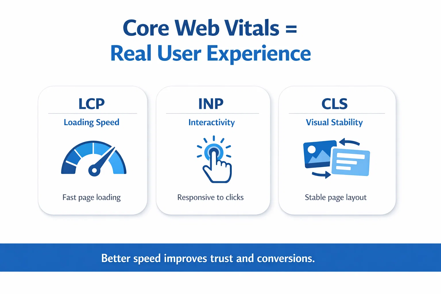
Core Web Vitals include:
- LCP (Loading): how fast main content appears
- INP (Interactivity): how quickly interactions respond
- CLS (Stability): whether layout shifts unexpectedly
These metrics exist because users hate janky pages. And janky pages ruin conversions.
Practical fixes that improve UX quickly
Performance improvements don’t require a full rebuild. You can start small.
Practical wins:
- Compress images (WebP/AVIF)
- Lazy load below-the-fold visuals
- Reduce heavy scripts and trackers
- Improve hosting + CDN setup
- Fix layout shift issues (reserve image/font space)
In product-led SaaS and fintech UX, speed and trust signals increasingly decide conversions because users compare experiences instantly across competitors.
How You Can Measure UX Improvements (Without Guessing)
If you cannot measure UX, you cannot improve it consistently. Strong teams rely on evidence, not opinions.
Track behavior using analytics + heatmaps
UX is measurable. You don’t need opinions, you need evidence.
You can track behavior using:
- Google Analytics
- Hotjar heat map + session recordings
- Maze usability testing
These help you identify:
- rage clicks
- scroll drop-offs
- form abandonments
- confusing tooltips
- broken navigation flows
When you combine analytics with user feedback, your UX improvements become repeatable and scalable.
Conversion rate + UX metrics must be used together
A high-performing website balances UX + marketing + product value. UX improves conversions, but it’s not the only factor.
Nielsen Norman Group explains conversion rate as whether users take a desired action and notes it’s a strong metric to track design improvements, while warning that non-UX factors can also affect it.
Use both:
- conversion rates (outcome)
- UX usability metrics (cause)
- journey drop-offs (diagnosis)
That combination gives leaders a true picture of growth.
UX improvement checklist (simple)
If you want a fast audit, start here:
- Can users find what they need in 5 seconds?
- Are buttons obvious and tappable on mobile?
- Are forms short and readable?
- Does the interface avoid confusing modals?
- Is the content structured with strong hierarchy?
- Does the site load fast on 4G?
- Is text readable with good contrast?
- Are confirmation messages clear?
- Are error states helpful?
- Is navigation predictable?
This checklist alone can lift usability significantly, especially for B2B SaaS websites.
Conclusion
If your website looks good but it is hard to use it is not a problem with how it looks. The problem is with the user experience of your website. The user experience of your website impacts a lot of things, such as trust in your website the number of conversions, search engine optimization and the credibility of your brand, over a period of time
Research-backed UX improvements can dramatically influence conversion outcomes, with Forrester-cited findings commonly quoted as high as 400% conversion improvements when experience becomes frictionless.
At BuildNexTech, we help teams design, validate, and scale UX-led websites using user research, prototyping, performance optimization, and testing workflows. Based in US, our team supports founders, CTOs, and product teams building AI-ready digital experiences that users actually love.When you apply User Experience Basics consistently, your website becomes easier to trust, easier to use, and easier to convert.
People Also Ask

What is the difference between UI and UX?
UI is how the website looks. UX is how the website feels to use from start to finish.
What are the basics of UX design?
Clarity, navigation, accessibility, usability, speed, consistency, and user testing.
How do I improve UX on my website quickly?
Start by improving navigation, simplifying layouts, optimizing page speed, and fixing confusing forms.
Does UX affect SEO rankings?
Google Forms for surveys, Figma for prototypes, Hotjar for heatmaps, and Maze for testing.
What tools can I use for UX research?
Google Forms for surveys, Figma for prototypes, Hotjar for heatmaps, and Maze for testing.


.webp)
.webp)
.webp)