

Three dashboards. Three different revenue numbers. Nobody agrees which one is right because each pulls from different data sources. That is usually the moment a team decides it needs new business intelligence tools, not because the old business intelligence dashboard looked dated, but because nobody trusts it enough to make data-driven decisions from it.
Most teams do not need the "best" BI tools on the market. They need the one that matches how the organisation decides things, a shorter list than the fifteen AI tools most roundups hand you, and this is a filtered shortlist of seven, picked for fit. Across 150+ engagements spanning 30+ industries, we have watched teams burn months on identical pitch decks before landing on a tool that fits.
What are Business Intelligence Tools
Business intelligence tools collect data from scattered sources, clean it up, and turn it into something a team can actually use to make a decision. That is the whole job, whether the vendor calls it a BI platform, a reporting tool, or an analytics tool.
What a modern BI tool now includes:
- Interactive dashboards and real-time dashboards that update live, not static exports.
- Self-service BI and self-service analytics so business users build reports without IT.
- Natural language querying and natural language analytics for plain-English questions.
- AI-powered analytics and AI-powered insights that run anomaly detection and surface trends early.
- Predictive analytics and machine learning built into the platform, not bolted on.
- Data governance: Role-based access controls, row-level security, and data security by default.
- KPI tracking against key performance indicators and market data, alongside data mining across records.
.webp)
Gartner projects that by the end of 2026, roughly 40% of enterprise applications will run task-specific AI agents inside their analytics stack, part of the broader shift toward AI business intelligence tools (Gartner).
How We Picked These 7 Business Intelligence Tools
We filtered on three things:
- Enterprise adoption: A tool other teams have actually leaned on under real deadline pressure, not just one with a good funding announcement behind it
- Depth of AI-powered analytics: A copilot that only autocompletes a formula is not the same as one that flags an anomaly before anyone thinks to ask.
- Pricing transparency: Teams fixing a broken reporting process do not have six weeks to chase quotes through three rounds of demos just to find out what a seat actually costs.
We also left off a few well-known names that only make sense bundled inside a much larger enterprise contract, since that is a different buying decision to the one this shortlist is built for. Most business intelligence platforms and business analytics tools on the market clear at least two of these three bars, while very few clear all three with support from an experienced AdWords consultant.
7 Business Intelligence Tools
Each of these earns its place for a specific kind of team, and none is the universal answer. Here is what each tool is, what it is best for, and what it does day to day.
1. Microsoft Power BI
Microsoft Power BI is Microsoft's business intelligence platform for turning raw data into interactive reports, built around the Microsoft 365 ecosystem. It is best for teams already in Excel, Azure, or Teams, since a Power BI dashboard pulls straight from those tools.
What it actually does:
- Connects to hundreds of data sources and builds an internal data model.
- Lets users create BI dashboard views with drag-and-drop visuals or natural language query prompts through Copilot.
- Self-service dashboards handle day-to-day reporting, while formatted reports and report distribution cover recurring updates.
- Pricing tiers are where the friction shows up; Premium capacity is where budgets get renegotiated.
2. Tableau
Tableau is data visualization software built around visual storytelling rather than raw reporting speed. It is best for teams where a dashboard needs to persuade a room, and for teams doing serious dashboard development with an analytics team.
What it actually does:
- Drag-and-drop chart building plus Tableau Prep handle data transformation before a chart gets built.
- The resulting Tableau data visualization work is still the benchmark other vendors compare against.
- Analysts use it to build data visualization examples stakeholders read instantly.
- Costs more than Power BI at enterprise scale, hard to justify unless visualisation quality is the deciding factor.
3. Qlik Sense
Qlik Sense is an associative analytics platform built for exploring relationships across datasets, not one fixed drill-down path. It is best for analysts who follow a question wherever it leads.
What it actually does:
- The associative engine indexes every connected data source in memory, so clicking one value filters everything related to it.
- Qlik Replicate handles data integration, syncing data from source systems in near real time.
- Qlik Automate scripts operational workflows once data lands.
- Trade-off: A steeper learning curve than Power BI or Tableau.
4. Looker
Looker is Google Cloud's governed analytics platform, built around a semantic layer that defines what every metric means before anyone builds a chart. It is best for data-engineering-led teams already on BigQuery or Snowflake who need one trusted number, not five.
What it actually does:
- LookML semantic layer sets metric definitions once, centrally, so "revenue" means the same thing in every report.
- Ad hoc business users who want to self-serve without touching a modelling layer will find it more structure than they need.
- Not the same product as Looker Studio (formerly Google Data Studio), Google's free tool often paired with Google Sheets.
5. ThoughtSpot
ThoughtSpot is built around search-driven analytics: Users type or speak a question and get a chart back. It is best for teams that want the clearest AI for business intelligence experience, where the AI is the interface itself.
What it actually does:
- Spotter handles natural language querying and natural language analytics, translating plain English into a working query.
- SpotIQ runs anomaly detection in the background and surfaces patterns nobody asked about.
- Behaves less like a dashboard and more like a built-in AI Data Analyst, a strong pick if you are building a list of AI BI tools worth trialling.
- Teams needing heavy custom visuals may still prefer Tableau or Power BI.
6. Domo
Domo is a cloud-first platform that handles ingestion, transformation, and visualisation in one product. It is best for executive teams who need real-time dashboards on a phone between meetings.
What it actually does:
- Pulls in real-time data from hundreds of connectors.
- Applies AI-powered analytics through its Domo.AI layer.
- Pushes results to mobile-first, real-time dashboards built for glanceable reporting.
- Real-time analytics here means minutes, not the overnight refresh cycles common on older BI platforms.
- Credit-based pricing is the catch: Costs climb fast if usage spikes.
7. Zoho Analytics
Zoho Analytics is a self-service BI platform for small and mid-sized teams that need enterprise-grade reporting without an enterprise-grade budget. It is best for SMBs already on other Zoho products, or budget-conscious teams that want a BI platform without a six-figure contract.
What it actually does:
- 250+ pre-built API connection options cover most common DB Technologies and SaaS platforms.
- Pulling data from CRMs, spreadsheets, and marketing tools rarely needs custom engineering.
- Zia, its AI tools assistant, handles quick data mining and natural language questions.
- Ships with customizable reports out of the box.
- Performance softens above 10 million rows.
Business Intelligence Tools Compared
This BI tools comparison starts with pricing and AI depth. Cloud business intelligence tools and cloud BI tools now dominate as SaaS platforms replace on-premise installs; cloud deployments held 65.87% of BI market revenue in 2025 (Mordor Intelligence), especially once AI add-ons hit enterprise BI platform pricing. Dundas BI, Cognos Analytics, SAP Analytics Cloud, SAP BusinessObjects, Oracle BI, and Qlik Cloud Analytics round out the long tail of business intelligence software tools and business intelligence reporting tools.
Which one fits your team?
- Already in Microsoft 365, need a fast rollout? Power BI.
- Visualisation quality drives stakeholder buy-in? Tableau.
- Governance and one source of truth on a cloud warehouse? Looker.
The Power BI vs Tableau debate comes down to that first fork. None of these seven close the governance gaps on their own; that is the real limit of even the best business intelligence tools here.
How BuildNexTech Extends Your Business Intelligence Stack with Agentic AI
That gap is where most BI investments quietly lose value. A KPI breaches a threshold on Tuesday, and nobody notices until Thursday, by which point a shift in user behavior has already cost something. Our agent orchestration layer sits alongside whatever BI tools a team already runs, acting as an AI Data Analyst that turns data alerts into action, routing anomalies from interactive dashboards into the right operational workflows through an embedded analytics layer.
A logistics client running Power BI cut manual follow-up time on flagged anomalies by 60% in a month, with workflows live in days, not months. Teams choose this over custom automation for three reasons: AI-native architecture, a low-code agent builder they can maintain, and no model lock-in.
What a BuildNexTech + BI Integration Looks Like
The comparison above answers "which dashboard." This section answers "now what."
- Days 1 to 3: Connect your BI tool via a simple API connection.
- Days 4 to 7: Define which key performance indicators trigger an action.
- Week 2 onward: The workflow runs live, monitored for edge cases.
Who This Is For
This is built for teams that already have a working BI tool and are stuck on the same wall:
- A retail team running Tableau across 40 stores, where dashboards are accurate but every anomaly still needs a human to notice, decide, and act.
- A logistics team whose shipments get flagged late in Power BI but nobody escalates until a customer complains.
- A finance team manually re-running the same reconciliation report every time a number looks off.
- Any team where user adoption was never the blocker; training and adoption plans were.
Conclusion
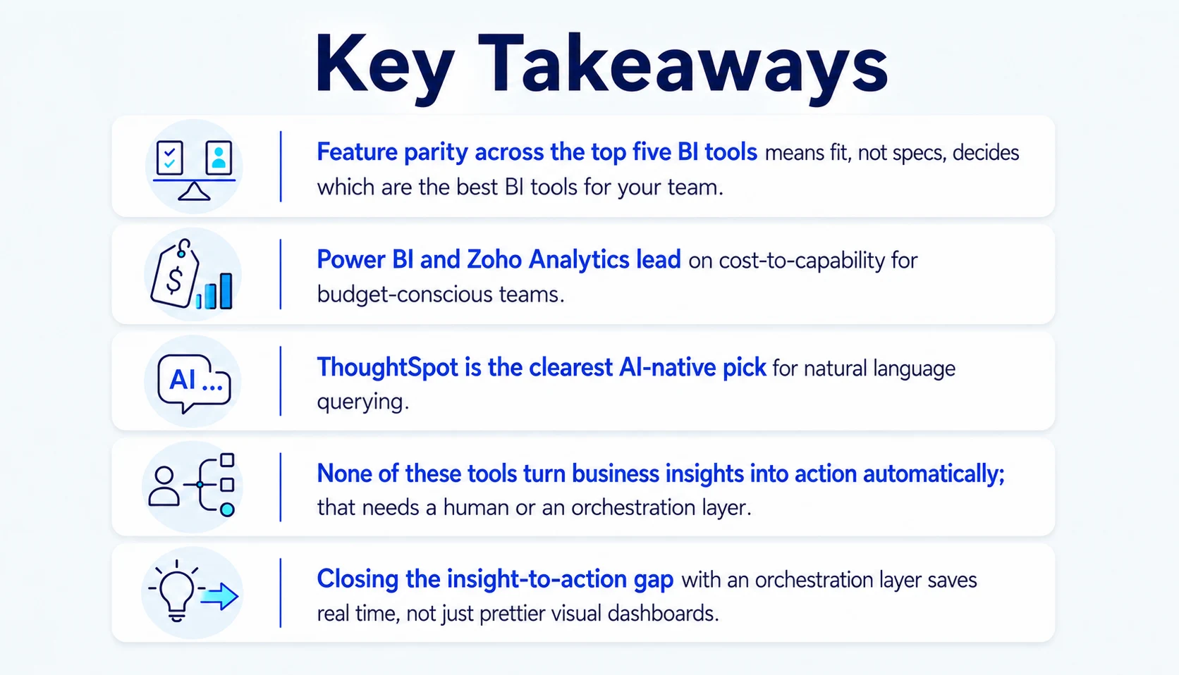
Picking a BI tool by feature count is how teams end up redoing this comparison in eighteen months. Pick by fit instead: The stack your team lives in, how much technical depth you have, and how fast you need something live. Power BI and Zoho Analytics suit budget-conscious teams. Tableau and ThoughtSpot earn their premium on visual polish and natural language search. Looker and Qlik Sense make sense once governance or associative exploration is the real bottleneck. Use the comparison table as a filter, not a verdict. Dashboards were always step one, and what a team does with the insight is step two, the part most BI rollouts never plan for.
People Also Ask

How long does it typically take to roll out a new BI tool across a team?
Most teams see a working dashboard within two to four weeks, but full adoption, when staff actually use it daily, usually takes eight to twelve weeks, including training.
Do smaller teams need a dedicated data engineer to run a modern BI platform?
Not usually. Self-service platforms like Power BI and Zoho Analytics are built for business users, though teams with complex, multi-source data models still benefit from engineering support.
What's the difference between BI reporting and BI analytics?
BI reporting tools and business reporting software summarise what already happened in scheduled reports. BI analytics goes further, letting users explore why through interactive queries and predictive models.
What is data visualization in a business intelligence tool?
Data visualization is the layer that turns rows and columns into charts, dashboards, and other visuals a person can read at a glance to make a decision.
Is it worth evaluating open-source BI tools before paying for an enterprise platform?
For small teams with in-house engineering support, yes. Open-source options save licensing costs but shift the maintenance burden in-house, which often costs more in time than it saves.


.webp)
.webp)
.webp)

.webp)
.webp)